Process
So, a few people have asked me how exactly I go about drawing this stuff – and thus I took some terrible phone photos while drawing a strip. Here’s everything I did when making a comic near the end of 2014
1. Planning.
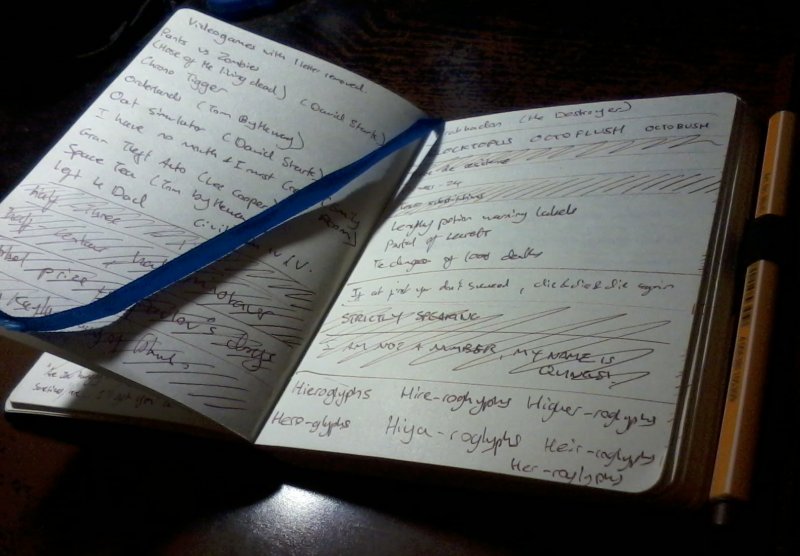
It’s a cliche, but there’s a reason why the two most common pieces of advice you see are “draw something every day” and “take a notebook everywhere you go.” – Like all skills, your drawing will improve vastly the more time you spend on it, and the more practice you get, and that’s fairly self-evident. The notebook thing I never really thought would make a difference until I started doing it.
The notebook goes with me wherever I go, and it’s transformed the way I work. Before, I’d find that when the time came to make a comic, I’d be trying to force ideas out and getting nowhere. It’s a rare occasion where I have an idea at my desk and want to make a comic immediately. Most ideas come in the weirdest places, and without a book to make a note of them, I forget them before I get home. Being able to keep track of ideas the moment I have them has made it much easier to keep a regular update schedule.
Additionally, some ideas seem really good, but I don’t have an idea how to work it into the format of sequential-art. Keeping those ideas around means that I can remind themselves and mull them over when I’m bored. Some of the comics I’ve drawn in the last year have been ideas that were on the back-burner for over a year before I figured out how to make best use of them.
The notebook itself is a Monsieur Notebook – which I’ve modified with an elastic loop to hold my pen. These notebooks have beautiful paper, and are incredibly rugged – which is good considering how badly I treat the thing.
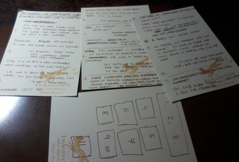
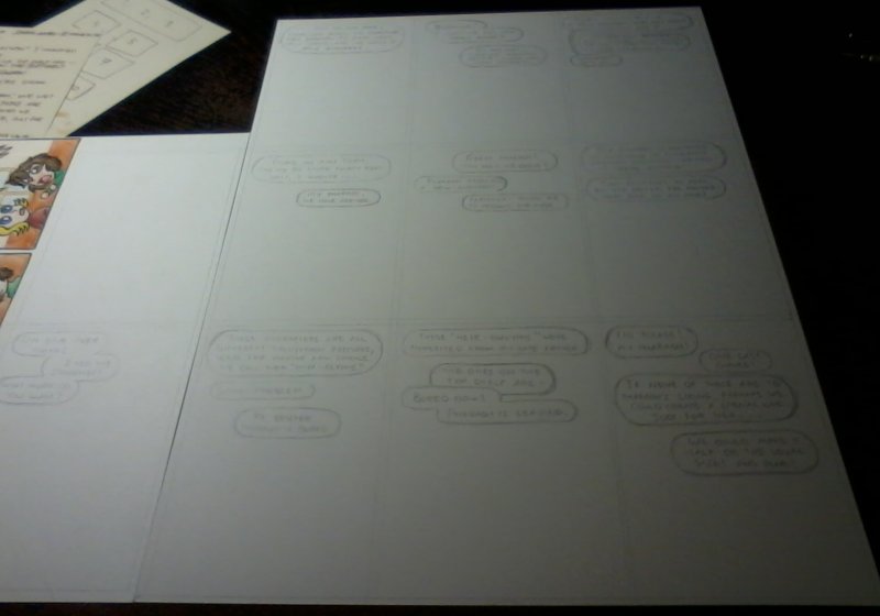
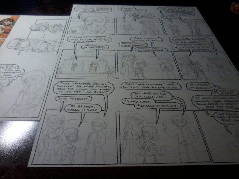
Once I’ve chosen an idea, the next part is scripting and dialogue. I usually use a tiny piece of notepaper for scripting – because the comic format is incredibly demanding on text space. If I can’t fit it on a small piece of note-paper, it’s no good for comics. In this case, I was planning a long comic, so I allowed myself more space.
I don’t often do any storyboarding, as I have an idea of what the comic will look like from the script – but in this case I wanted to figure out how I was going to use my paper before I started.
2. Pencils.
Once I have my script, it’s time to move onto penciling the comic. I have a bunch of tools I use for this:
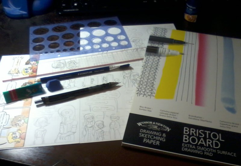
My pencil of choice is the Rotring Tikky. I use a 0.5mm lead, because whenever I try to use a 0.3mm lead I break it. Normally for penciling I’ll use a 2H lead. Most comic artists who have a pencils stage use a photo-blue pencil, then ink over that before scanning and doing everything else digitally, but they don’t really work for me.
I draw all my comics directly onto Bristol board, which is a little expensive – but Bristol board is much nicer to draw on than paper, the pencil erases much more easily. It also has the added advantage that the originals are on nice thick board when I’m finished, which makes them a lot nicer to send to people than a natty piece of paper would be. I use Windsor and Newton board, it feels slightly nicer to me than Daler Rowney, but the difference is very minimal.
The other tools I use for penciling I’m much less picky about. Here I’ve got a triangular Stabilo pencil eraser (which is very nice and comes in lots of neat colours) and a Staedtler Mars Rasor eraser pencil. The eraser pencil is pretty neat, as you can sharpen it to a very fine point and erase very small parts of your picture. If you’re a sketch artist, you should try one of these out. Faber Castell make one that’s very good too. The brush on the end is a gimmic as far as I care. Finally, I use a good art ruler for drawing gutters and straight lines, and a circle template, which I’d be entirely lost without.
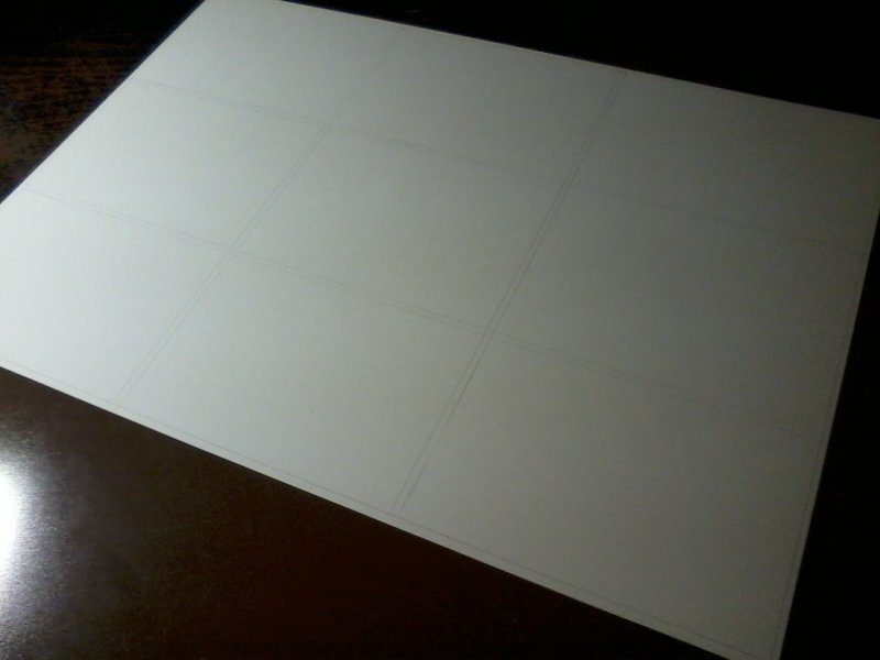
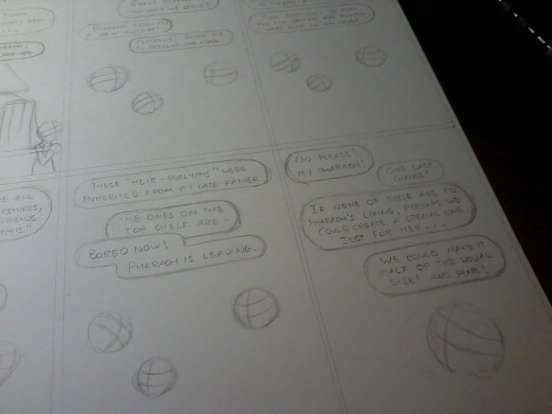
The first thing I do is plot out the panel gutters. For this comic, it was pretty boring though.
Next, I usually plot out the dialogue. This is the absolute lazy way to make a comic quickly though. It’s helpful to know exactly how much space the dialogue is going to use up before I do my art, and there’s nothing worse than drawing something you’re really happy with only to discover you’ve no space for the speech balloons!
The big risk with this approach is that you can end up with very formulaic layouts, where the dialogue reads along the top of the panels, and the art along the bottom, leaving the reader reading along the speech bubble line without ever really looking at the artwork. Sometimes If I really have a strong impression of how I want to fit the speech bubbles around and through the art layer, I’ll draw them both in parallel.
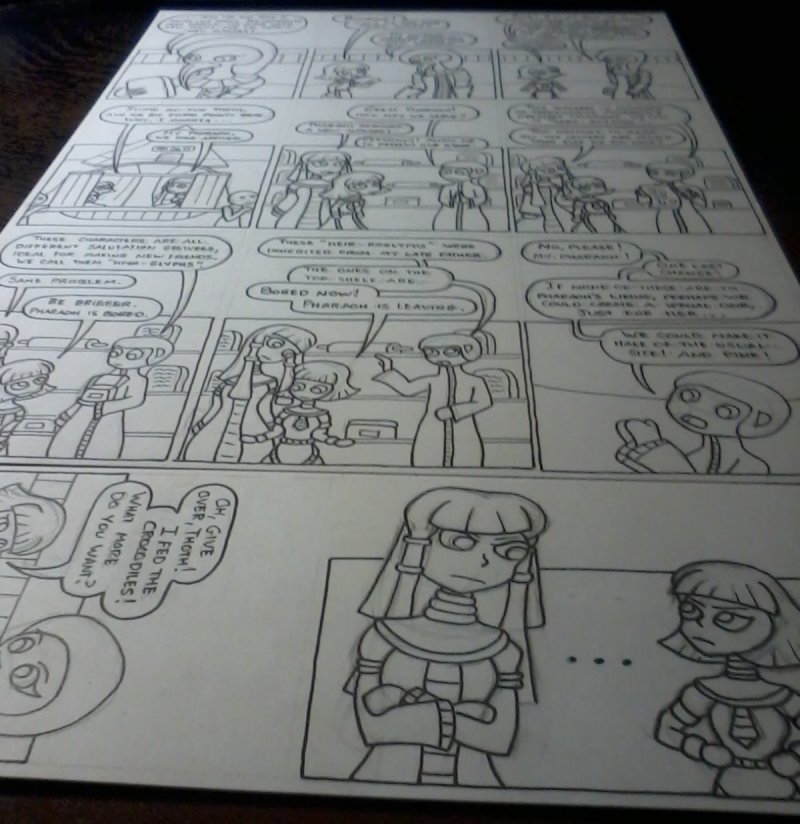
For most of my comics, I use plain simple backgrounds, as it’s quicker and easier, and environment isn’t usually important to the joke I’m making. If I want to include an important establishing shot, I’ll block out the scenery first, but most of the time I start with the location of the character heads.
The head is almost always the most important part of character art, as it contains all the expression, and it lets the reader quickly know who’s doing what – so getting the placement of the heads lets me quickly figure out where everything in the panel will go. The other lines in the circle give me the center-line for the face, and (approximately) the tops and bottoms of the eyes.
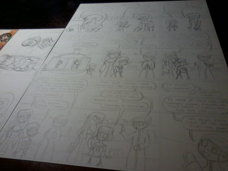
Once that’s all down, it’s just a matter of filling in the character details, and maybe a few background elements, and the pencil work is done! There’s nothing particularly insightful or special in this part.
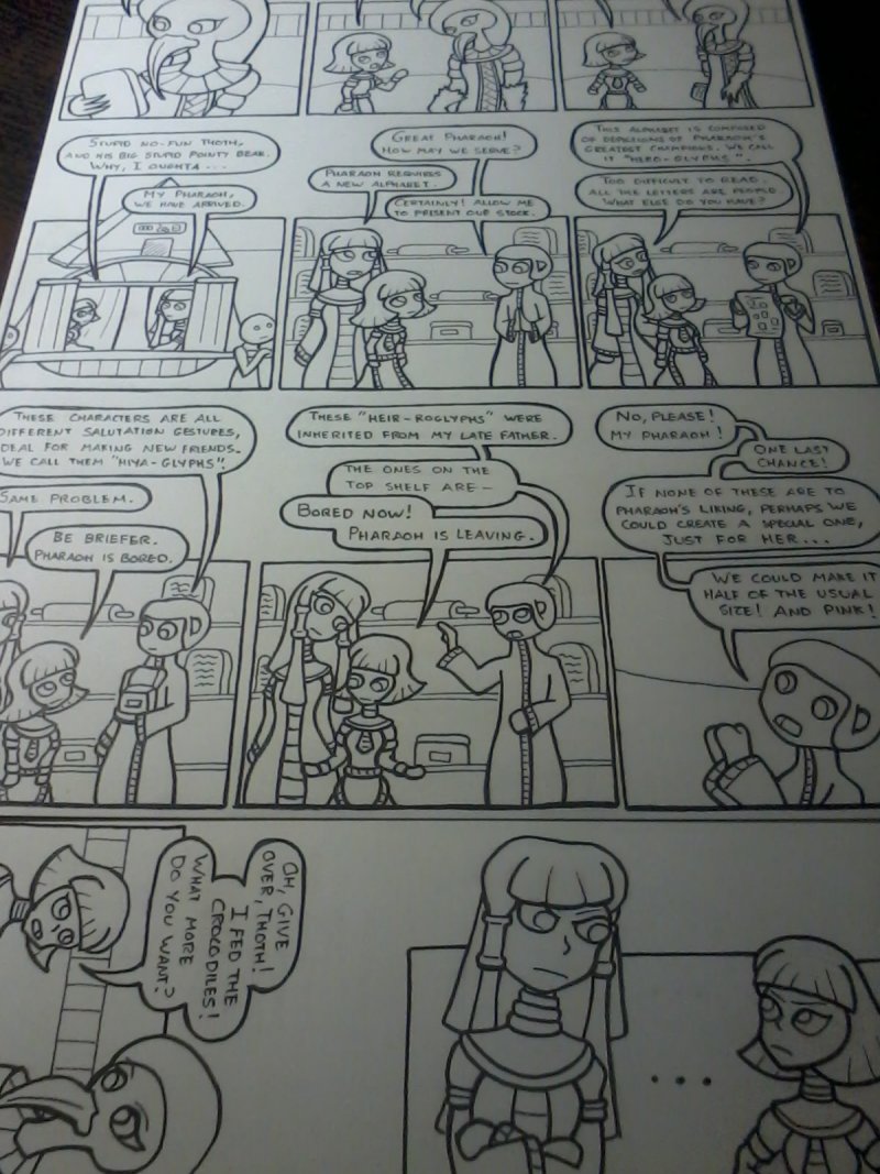
3. Inks.
With the pencilwork down, the next stage is to ink everything. My pencil lines are full of construction lines, and wobbly mistakes – and worse they don’t give nice bold outlines that give good contrast on a computer screen. At this point a lot of people move over to digital, but my process is pretty much analogue all the way.
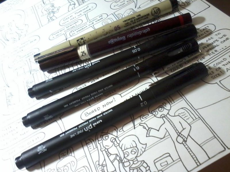
My tool of choice for linework is the pigment liner. I’ve tried using proper dip pens and india ink, and I’m just too sloppy. Pigment liners give you a nice consistent-width line that doesn’t erase, and they’re very clean to work with. My liner of choice is the . The quality of these is superior to geo-liners, but slightly worse than Microns or Staedtler liners. However, the Mitsubishi seems to last much much longer in my hands, so I choose them when I can.
If I have some very fine inrtricate details to ink, I’ll also use a Rotring Rapidograph engineering pen – this is pretty much the ultimate tool for any technical drawing, but they’re hugely expensive both to buy in the first place, and to use on a regular basis. I draw panel borders and speech bubbles with a 0.5 pigment liner, and I draw lettering and character art with a 0.2. What these widths actually give you changes quite a lot with brand however.
My first port of call with ink is to do the panel borders, then the lettering, then the speech bubbles. This makes sure that I’m not squeezing the lettering into too small a space, and it comes out legible. Well, as legible as my drunken-spider scrawl can ever be.
Once I have my speech bubbles and lettering done, I’ll ink the rest of the art, starting with foreground elements and working back through the scene (if there are any background elements) – By working from the front of the image backwards, I can make sure that none of my linework for background elements intrudes over the foreground stuff.
This is always the scariest part of the process. Pretty much everything else allows for corrections if I make a mistake, but once I put ink to paper, I’m stuck with it. For lettering, I can always re-write the contents of the speech balloon to one side and digitally move the text, but if I make an error in inking the artwork itself I’ll have a much tougher time fixing it later.
With the ink down, I’ll normally take a short break to ensure it’s completely dry. Pigment liners dry out very fast, but if you’re erasing any heavy pencil work, and the ink is fresh, it can fade a little.
Once the ink is properly dry, I’ll erase all the pencil lines, and check that I didn’t miss anything. I then usually go over the ink lines a second time, to make them a little darker, and to add a little weight to the more important lines. Often the effect is very small, and I’m no expert, but it usually feels worth the time.
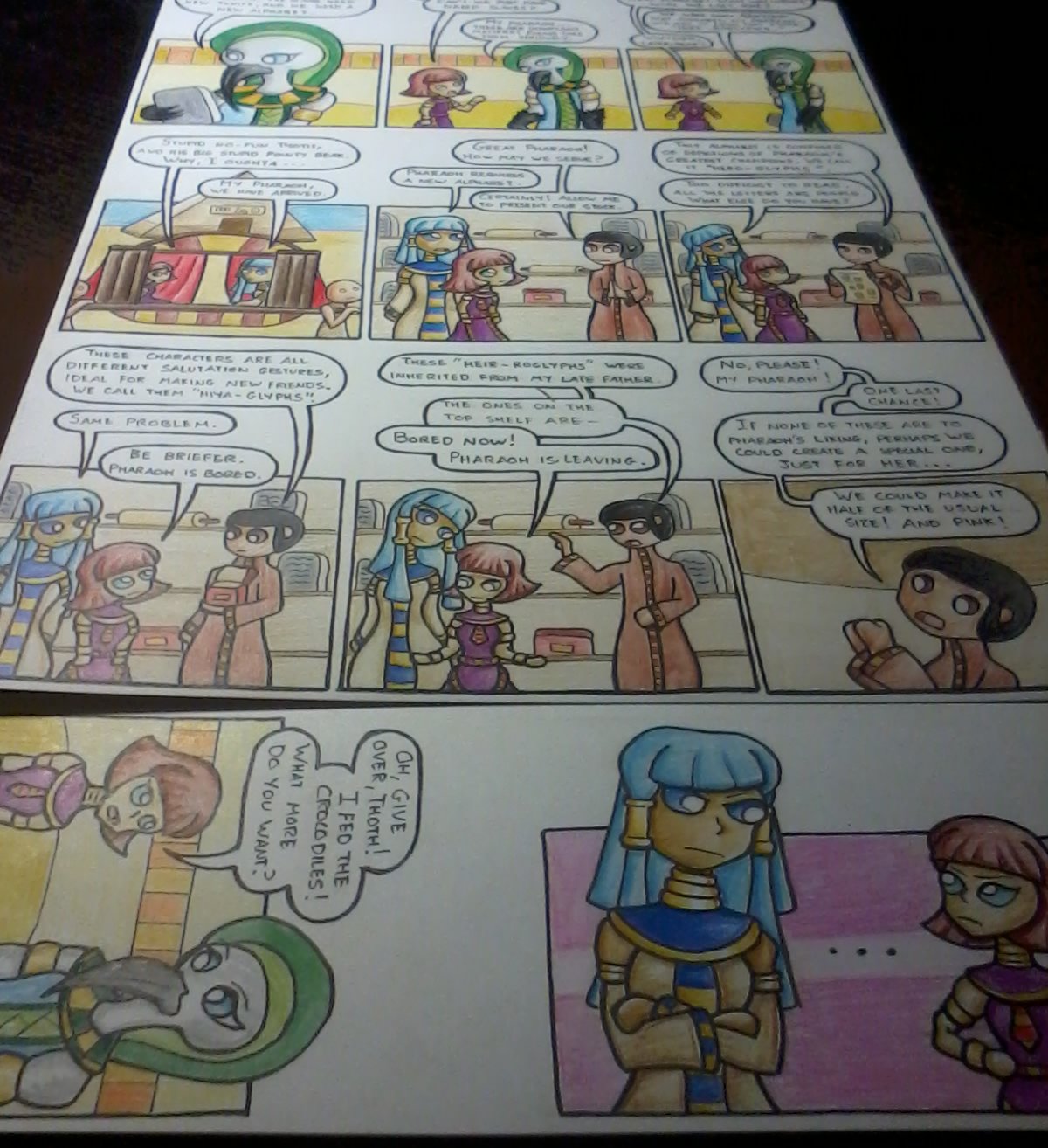
4. Colours.
Even though most of the other tools I use are top quality super-expensive options My pencils of choice for colouring are fairly cheap. By far my favourite pencil for colour is the Staedtler Ergosoft pencil If you want a strong vibrant colour, then coloursoft pencils are really great, and these particular ones are a joy to use. The big downside is that Staedtler only make them in 24 colours, so I’m quite limited if I use only them. When I want a very specific colour, I’ll usually back up the Staedtler with the Faber Castell Polychromos pencil – which comes in 120 colours.
With the second layer of ink dry, I’ll use these colour pencils to colour and shade the whole image. There isn’t any specific advice I have for this though


Discussion ¬