353 – D/C
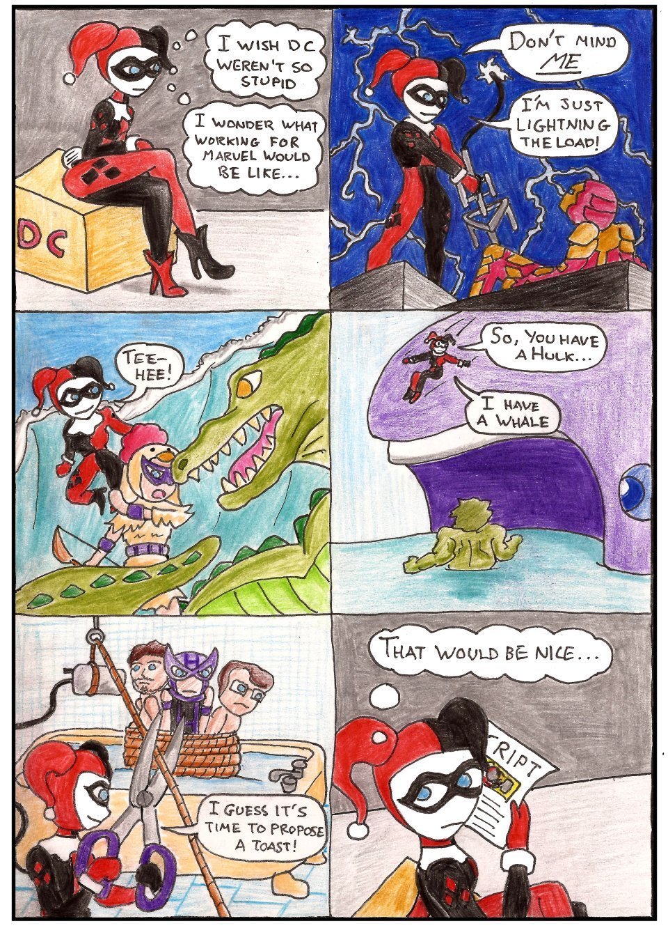
So, DC have a talent scouting competition, anyone is free to enter. All they have to do is draw one comic page, following a given script, and the winner will be featured in the new Harley Quinn comics.
It’s neat that they’re opening up to let people take part. Isn’t it? Well… it is until you see the script.
The internet of course, reacted strongly, and with outrage. Rightly so. Sure, it’s possible to draw these scenes in a tasteful manner, but with DC’s track record it’s much easier to believe this scene is written as the sexualisation of suicide.
If that wasn’t enough, Jimmy Palmiotti then chose to weigh in with an ‘Apology’ as expected, the tone of his apology is insensitive, and apologises that people were offended, rather than apologising for causing offense. He explains that it’s totally alright in context really, and that people misinterpreted it, shifting the blame nicely before reeling off a list of “strong female characters” he writes, which include some of the most oversexualised characters in comic history.
It’s okay though. It’s not DC’s fault it’s his. He says. With the right context and guidance, the script is totally fine Guv’. Which is why, five days after the script went up, following all the furore and debate on the issue… There has been no change to the competition page. At all. If it’s only possible to correctly interpret the intent of this scene with the context and guidance offered by Jimmy in hindsight, you’d think it’d be worth adding to the page?
On the other hand, maybe DC just want to hire artists who’ll draw any crap that’s put their way without… say… quitting in outrage.
EDIT:
Today (15th Sep) DC have apologised for this:
“The purpose of the talent search was to allow new artists an opportunity to draw a single page of a 20-page story. True to the nature of the character, the entire story is cartoony and over-the-top in tone, as Harley Quinn breaks the 4th Wall and satirizes the very scenes she appears in. DC Entertainment sincerely apologizes to anyone who may have found the page synopsis offensive and for not clearly providing the entire context of the scene within the full scope of the story.”
So… have they now added this context to the contest page? Nope.
Okay, now for some notes about the art.
1) Okay, so I veered away from the brief a little bit.
2) Harley Quinn’s outfit is copied from Batman of the Future (Batman Beyond). I like this outfit better than most of the other ones, it’s a bit less schoolgirly, and it’s totally jestertastic. It’s also lot more fun to draw than I thought it would be, the quartered panels really help you define the bodyshape as you go.
3) Harley’s poses in panels 1 and 6 (where she’s in the DC universe) are taken from scans of DC comics showing Harley Quinn that I found around the internet. This is why her legs are so ridiculously long in panel 1. I actually swapped the leg colours in panel 6, because pretty much all of the image was black, so it’s deliberately wrong, I know.
4) I used reference images while drawing Harley’s fantasy panels: Harley’s poses in panels 2,3,4,5 were copied from empowered male stances from the covers of Marvel and DC comics. Iron Man, Hawkeye and the Hulk’s poses were all copied from female disempowered poses. The art is really small though, so I don’t think you can tell that I did this. Additionally, converting the bodyshapes from those poses into the bodyshapes of these characters from those comics undid quite a lot of that work, but I feel it’s important that I tried.
5) Hawkeye in a chicken costume is hella funny to me.


Rejected puns for panels 3 and 4
“What are you? Chicken?”
“I’m having a whale of a time!”