24 HCD – TO THE SKYLAB
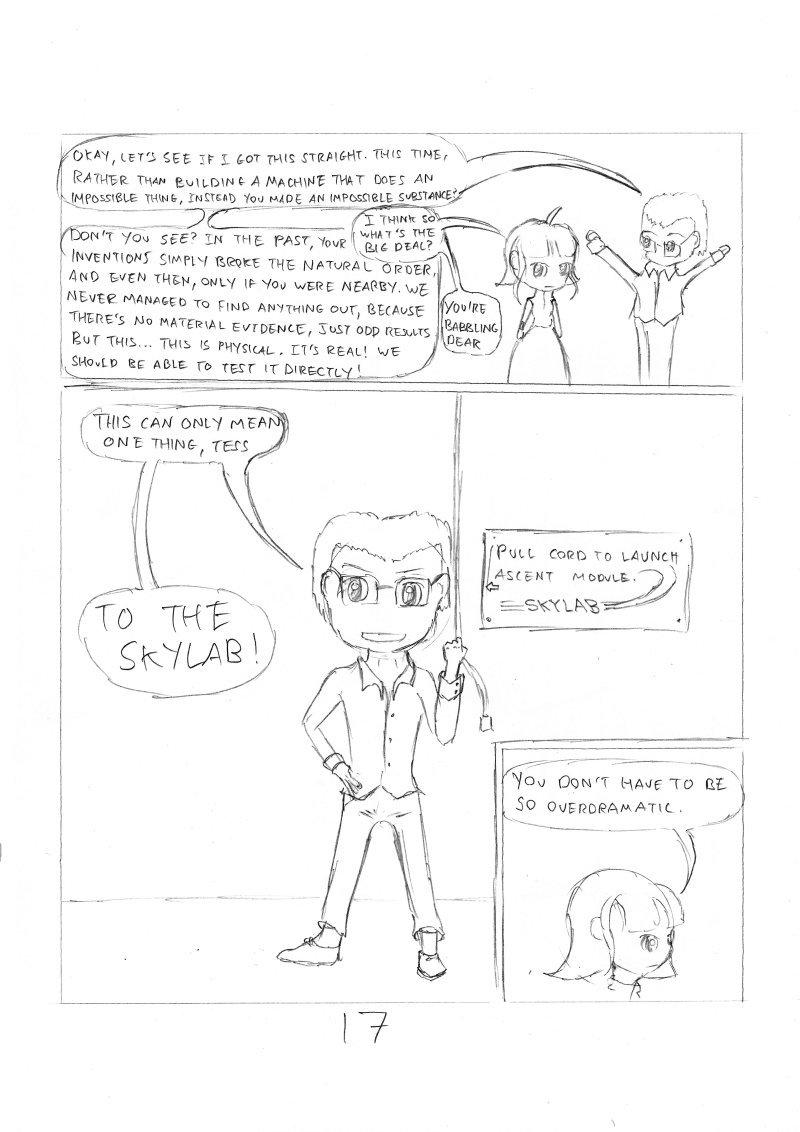
Here is an absolutely fantastic example of absolutely terrible panel layout.
The intention was to draw a full-page splash of Oliver heroically posing and shouting “To the Skylab!” – mostly because blocking out the remaining plot had taken me around an hour, putting me an hour behind schedule.
However, in order to get to the point where I could draw that image, I first needed to establish why why they needed to go to a lab at all. That’s quite a lot of dialogue – which I proceeded to cram into as small a space as possible to make room for the full-body shot.
In hindsight, the large panel is mostly empty – I don’t have much of a background within which to place the character – so the full body shot is mostly wasted. Also, he’s not quite large enough for me to start putting in small interesting details, so he looks a little plain.
If I were making this up properly, I’d expand the dialogue at the top to contain more jokes, and fill a page – then do a splash. If I were still constrained to 24 pages, I’d expand the dialogue at the top of the page, and fill most of the space. At the bottom I’d do a zoomed in closeup of Oliver’s eyes, to put emphasis and intensity on the declaration – and I’d have Tessa’s comment in a cut-out within that panel. The whole thing would have much better aesthetics that way.
This is page 17 in the 24HCD challenge – If you would like to read the whole story, then you can start here


Discussion ¬